
How We Designed a PDF Reader for Every Fold of iPhone Duo
The decisions behind Duet on iPhone Duo: what goes on each half, what stays off the crease, and why a fold should never cost you your place.
By Deepanshi Mamgain · · 7 min read
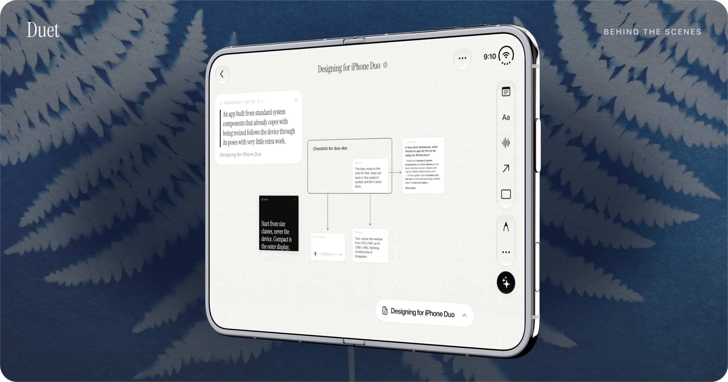
We designed Duet for iPhone Duo around one rule: the layout changes with the fold, and every feature stays. In practice that means text that flows through the crease while cards, buttons and sheets stay off it, controls on the stable half when the phone sits on a table, layouts driven by the space available instead of by device checks, and a reader that always returns you to the exact line.
I'm Deepanshi Mamgain, and I make Duet at Conscious Engines Studio. This post is about the design decisions behind Duet on iPhone Duo: what we chose, why, and where Apple's guidance shaped it. If you want the tour of what Duet does in each position, start with Duet: Made for iPhone Duo.
A reader that has to work in six shapes
Apple published its design guidelines for iPhone Duo on the day it announced the phone, 9 September 2026. They describe a device people hold and set down in many ways: partly folded like a book, placed on a surface, standing on its edges. Add portrait and landscape on both displays, and Split View on the inner one, and a single app can find itself in a lot of shapes.
We planned around six that come up most for reading: closed in portrait, closed in landscape, open in landscape, open in portrait, half-folded like a book, and set down on a table. Apple hasn't named these officially, so we use the names people already use.
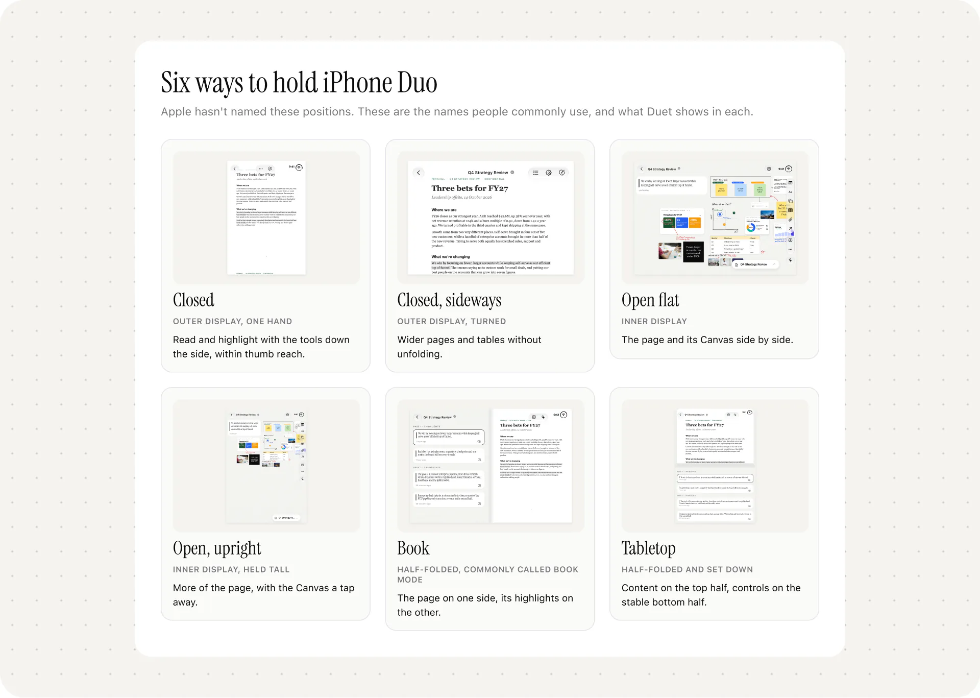
The easy mistake with a device like this is to design six apps. Apple warns against it directly. Its guidelines say supporting the poses doesn't mean a custom layout for each one, and that an app shouldn't reinvent itself when it resizes. That matched what we wanted for readers. If you learn Duet closed, you should already know it open.
One rule: the layout changes, every feature stays
The first decision was the one that shaped everything else. There's no "lite" Duet for the outer display and "full" Duet for the inner one.
Apple's guidelines ask apps to keep the same functionality across poses and the same state across displays, and to show an extra level of hierarchy on the larger display if it suits the content. Mail is Apple's example: one pane closed, two panes open.
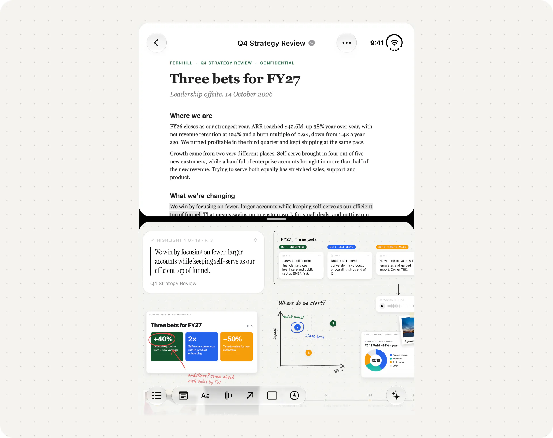
For Duet, the extra level is your thinking. Closed, you get the page, and your highlights and Canvas are still there when you want them. Half-open like a book, the highlights for the current page appear beside it. Fully open, the page and its whole Canvas sit side by side. Highlighting, the Canvas, voice notes and the AI assistant work in all of them. What changes is how much you can see at once.
Size classes and no device checks
The second decision was technical, and it's the one I'd most want another team to copy: Duet never asks what device it's on. It asks how much room it has.
Apple's guidance for iPhone Duo is blunt about this. It says to stop assuming that the idiom (iPhone or iPad) or the size class tells you which device you're on, because on iPhone Duo an iPhone app can have any combination of size classes. It says not to choose layouts from the device type, not to treat a regular width as "iPad", and not to hard-code screen heights. Apps should measure the space they're given.
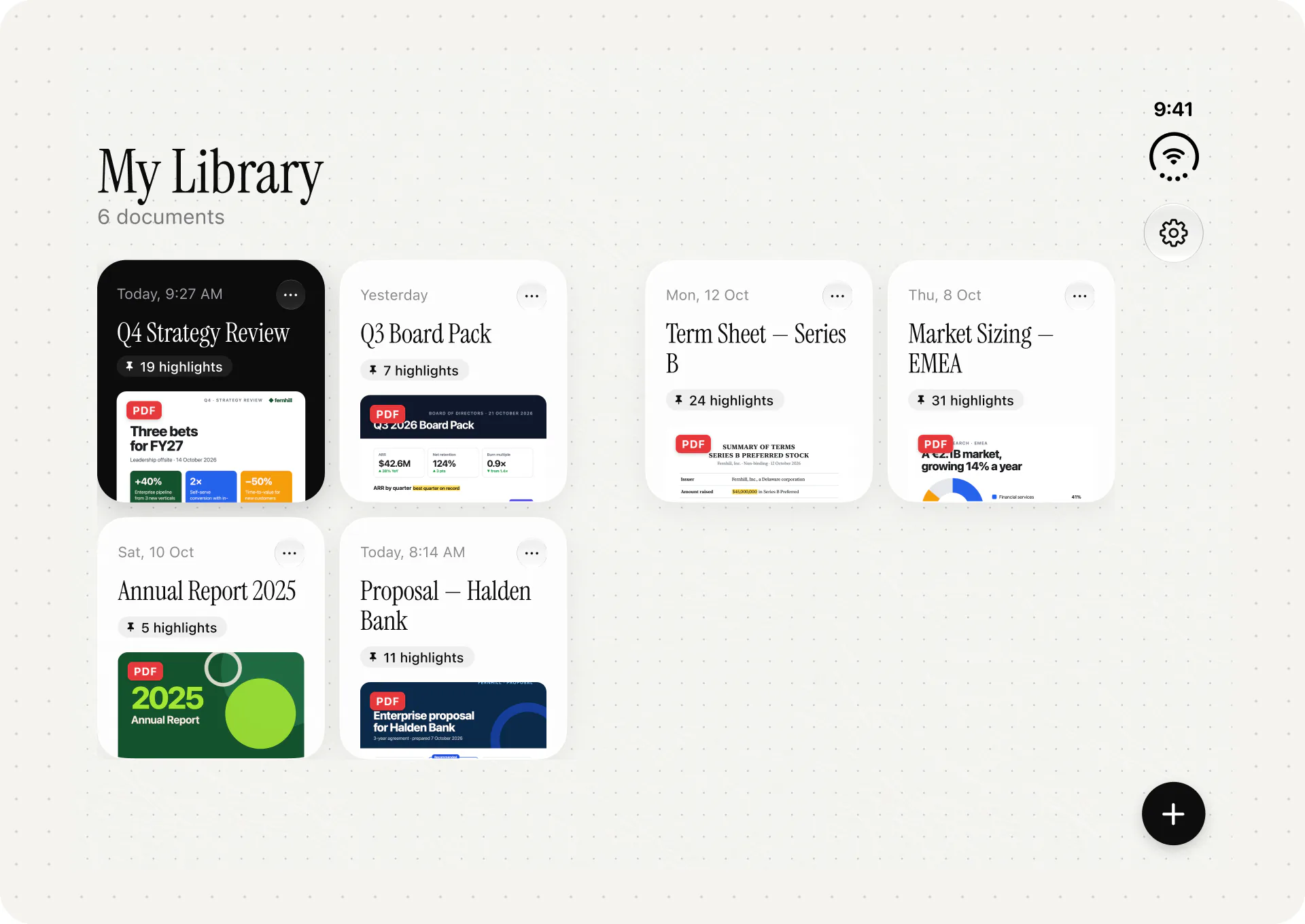
The HIG gives the fundamentals: a compact width layout for the outer display and a regular width layout for the inner display. That alone covers most of what a reader needs. The Library is a good example. Folded, it shows one column of documents. Unfolded, it shows two. Nothing in that decision mentions iPhone Duo. It's the same decision Duet would make for any window that wide.
This pays off in Split View. Apple says every app takes part in multitasking on iPhone Duo, so Duet can end up on half the inner display beside Mail or Notes, or in two windows of its own. An app that keys its layout to the device would get that wrong. An app that reads its available width gets it right without a special case.
Text through the fold, cards off it
The inner display folds down the middle, and that line is where the third decision lives.
Apple calls the fold a reserved region. When the phone is partly open, the fold divides the inner display into separate usable areas, and Apple asks apps to keep important elements clear of the centre. System alerts, menus and sheets move out of the fold automatically. For custom views, Apple provides a ReservedRegion API in SwiftUI and UIKit to find the fold and move content away from it.
But Apple also makes an exception that matters a lot for a reader. In its tech talk on adaptive layouts, it says continuous scrolling content such as articles, feeds, documents and lists shouldn't be displaced, because moving it between regions breaks the continuity of reading.
So Duet treats the two kinds of content differently. Text flows through the fold. A line of a PDF can cross the crease, and you keep reading. Cards, buttons and sheets stay off it. Anything you tap, drag or read as a single unit sits wholly on one side. A highlight card that straddled the crease would be hard to read and harder to grab, so we never let it.
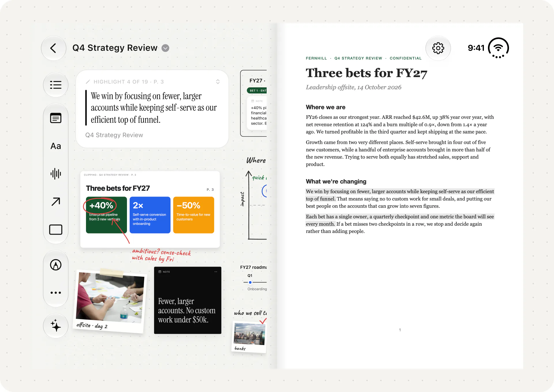
Apple's guidance also asks for small moves. It says to avoid extreme layout changes as the phone folds and to move only what's needed to keep things visible and easy to tap. We took that seriously. When you fold the phone part-way, we aim to move only what has to move to keep cards clear of the crease.
Controls on the stable half
The fourth decision is about your fingers.
On the outer display, iOS on iPhone Duo puts toolbars and tab bars down the side of the screen to save vertical space, and Apple asks apps to follow that system layout. Duet does: closed, the tools run down the side within reach of your thumb, so you can read and highlight one-handed.
Tabletop is where it gets more interesting. With the phone set down part-open, one half lies flat on the table and the other is angled up. Apple's tech talk describes the two halves as suited to different jobs: the upper half for content you look at from a distance, the lower half for controls, because it's a more stable surface to touch. Apple's own iPhone Duo page describes setting the phone down with easy access to controls at the bottom.
That's what Duet does in tabletop: the content goes on the top half, and the controls go on the stable bottom half. Tap the angled half of a phone sitting on a desk and it can rock under your finger. The flat half stays put.
Your place survives every fold
The fifth decision is the one readers notice least, which is how it should be.
Apple's guidance asks apps to keep the state of elements the same between displays. For a reader, the most important state is where you are. Fold the phone, unfold it, leave it on the table for hours, and Duet returns you to the exact line you were reading.
We designed it so that a fold changes the layout and nothing else. Your reading position and your Canvas don't depend on which display you're on. A fold shouldn't feel like closing a book and having to find your page again.
Finger first, for now
The last decision was forced on us, and I'd rather be clear about it. Apple says iPhone Duo will support Apple Pencil with USB-C later this year. Until then, Duet on iPhone Duo supports ink with your finger only. On iPad, Duet supports Apple Pencil and Scribble.
That shaped the Canvas on Duo. Every Canvas tool had to be usable with a fingertip: sticky notes, shapes and arrows, tables, photos and voice notes that are transcribed on the device. Ink is there for circling a figure or sketching a quick diagram.
What I'd tell another team building for iPhone Duo
None of this is secret. Most of it is in Apple's documentation, and the rest is what follows from taking it at its word.
- Decide what each half is for. Ours are the document and your thinking about it. Once that's settled, most layout questions answer themselves.
- Read the available space. Apple's own guidance points to size classes and the bounds you're given, and warns against device checks. It's also what makes Split View work.
- Let reading content flow; keep tappable things whole. Scrolling text can cross the fold. Cards and controls shouldn't.
- Put controls where the phone is steady. On a table, that's the flat half.
- Keep every feature in every pose. If a tool disappears when the phone closes, people stop trusting where things live.
- Never lose someone's place. Treat a fold as a change of shape, and let the session carry on.
If you're a developer, Apple's Designing for iPhone Duo guidelines and the Preparing your app for iPhone Duo documentation are the place to start. Our engineering side of the story, on running Duet's private AI with Apple's Foundation Models framework, is in What We Learned Building a PDF Reader on Apple's Foundation Models. And the colour decisions that sit on top of all this are in Six Themes, One Reader.
If you've just got an iPhone Duo and want the reader's view, How to Read PDFs on iPhone Duo covers Apple's built-in apps and Duet step by step.
One request
Duet is $19.99 once, with no subscription, no account and no ads. You can learn more at duetreader.app. If you try it on your Duo and the design decisions above work for you, a short review on the App Store helps other readers find it. If something in a fold feels wrong, tell us at deepanshi@consciousengines.com. That's the feedback that makes the next version better.
Deepanshi
Sources
- Apple Developer, Designing for iPhone Duo (Human Interface Guidelines, published 9 September 2026): poses, size classes, same functionality and state across displays, reserved regions, vertical controls.
- Apple Developer, Preparing your app for iPhone Duo: reserved regions, arrangement views, bars on the side.
- Apple Developer, Three steps to make your app shine on iPhone Duo: no idiom or device checks, measure available space.
- Apple Developer, Strike a pose with adaptive layouts on iPhone Duo: documents don't displace; controls on the lower half when propped on a table.
- Apple Developer, Leverage multiple displays and scenes on iPhone Duo: all apps take part in multitasking.
- Apple Newsroom, Apple unveils iPhone Duo: Apple Pencil with USB-C later this year.
- Apple, iPhone Duo: controls at the bottom when the phone is set down.
- App Store, Duet: PDF Reader, checked 20 October 2026.